Brandhub

This brandhub defines the visual identity of Xoriant. Use it as your single source of truth when creating any communication — internal or external. Consistency across every touchpoint strengthens recognition, builds trust, and reflects the quality we deliver.

Drop Image
Colors

Xoriant's color palette is built on clarity and energy. Each color serves a specific role in the visual system, and together they create a coherent, confident brand presence. Always use colors from this palette — never approximate or substitute.

Xoriant Green

Xoriant Green is the heart of our brand. Vibrant and purposeful, it signals innovation, growth, and forward momentum. Use it for primary calls-to-action, key highlights, and branded accents. Avoid overusing it — its impact comes from restraint.

Usage
  • Primary buttons and CTAs
  • Active states and selections
  • Brand accents and highlights
  • Logo applications on light backgrounds

Xoriant Green
hex:  #14BB30
rgb:  20 / 187 / 48
cmyk:  80 / 0 / 100 / 0
Background colors

Our background palette is built on subtle tonal shifts — from pure white to soft greys. These neutral foundations keep content legible and interfaces clean, letting Xoriant Green do its work without visual competition.

Snow White
hex:  #FFFFFF
rgb:  255 / 255 / 255
cmyk:  0 / 0 / 0 / 0
Ice White
hex:  #F5F7F7
rgb:  245 / 247 / 247
Mist Grey
hex:  #EEF1F1
rgb:  238 / 241 / 241
Cloud Grey
hex:  #E7EBEB
rgb:  231 / 235 / 235
Text colors

Legibility is non-negotiable. Our text palette ensures comfortable reading across all surfaces, from editorial content to interface copy.

Onyx Black
hex:  #1D1F1F
rgb:  29 / 31 / 31
50%
Slate Grey
hex:  #717373
rgb:  113 / 115 / 115
Drop Image
Logo's

Our logo is our most recognizable asset. Handle it with care. Never distort, recolor, or alter its proportions. Always use the approved files provided in this guide.

Logo with Tagline

The logo with tagline is our primary brand mark. Use it in brand-defining moments — launch materials, presentations, website headers, and anywhere we want to make a full impression. The tagline anchors Xoriant's positioning and should appear whenever context allows.

Logo

The standalone logo — without tagline — is our workhorse. Use it in contexts where the tagline would be too small to read, or where a cleaner mark is more appropriate.

Logo Icon

The icon-only mark is used when the full logo wouldn't fit or when Xoriant is already clearly established in context. It's compact, versatile, and recognizable at small sizes.

Xara Logo

Whitespace around the logo is not empty space — it's protection. Always maintain a minimum clear zone around all logo variants to ensure legibility and visual dignity. The clear zone is defined by the height of the "N" of the tagline.

Drop Image
logo White space

Sed posuere consectetur est at lobortis. Nullam quis risus eget urna mollis ornare vel eu leo. Morbi leo risus, porta ac consectetur ac, vestibulum at eros. Cras mattis consectetur purus sit amet fermentum.

Drop Image
Typography

Our typographic system pairs editorial elegance with functional clarity. Each typeface has a defined role — stick to it for consistent, polished results across all media.

Aa
Ivypresto-Display
Adobe Font
Title font

IvyPresto Display brings sophistication and editorial weight to our brand. Its high contrast and refined serifs make it ideal for large-scale headlines and key brand statements. It evokes quality and confidence.

Aa
DM Sans
Google Font
Aa
DM Sans
Google Fonts
Body & UI Font

DM Sans is our functional backbone. Clean, geometric, and highly legible at any size, it ensures that our communications are as easy to read as they are to trust. Use it for all body copy, UI elements, and supporting text.

Drop Image
Brand imagery

An image tells a thousand stories. Choose them with thoughtfully as every image directly influences the look, feel and experience of the Xoriant brand.

In general

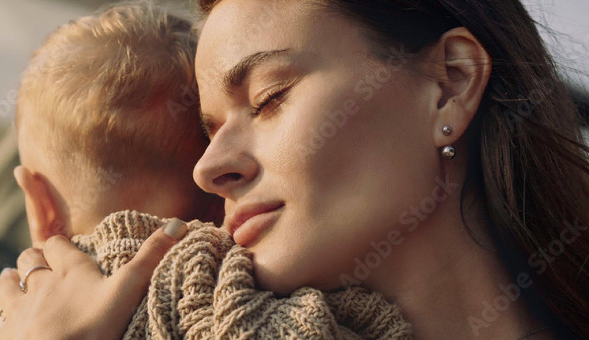
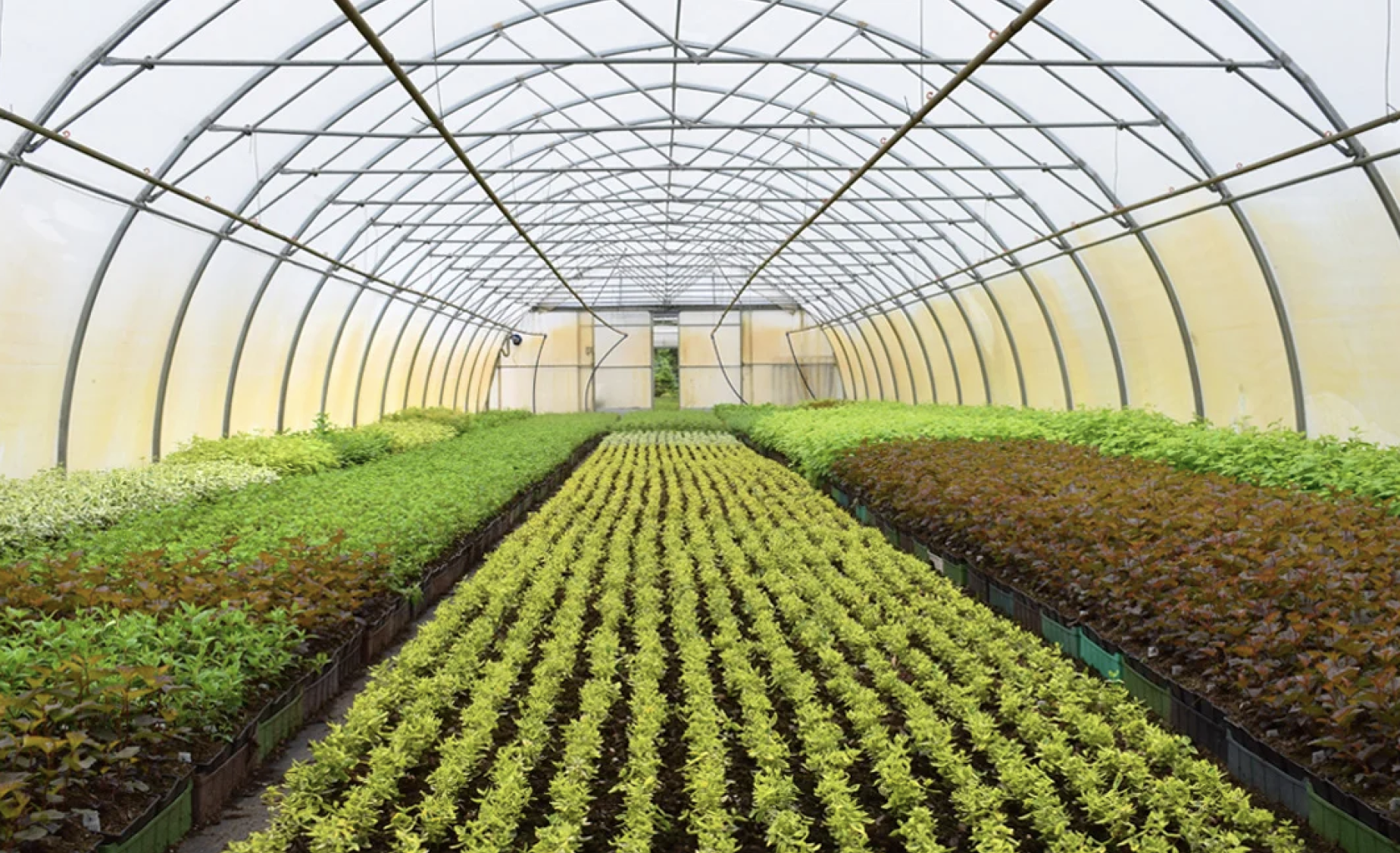
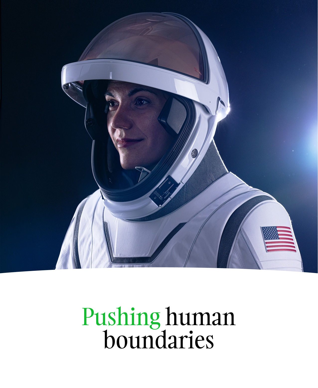
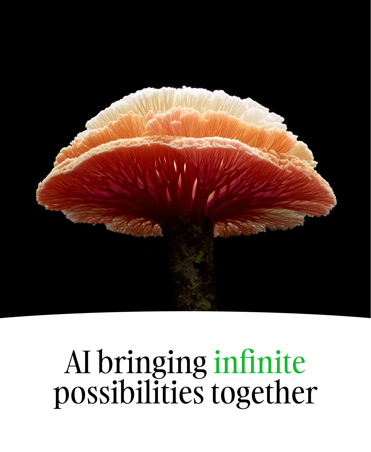
Use images where nature, human moments, light, and space carry the story. Images should express a feeling of ‘calm and room to breathe’. Nature and people are strongly encouraged, but not compulsory.

What we like to see

Images should feel real (not artificial or staged), calm, and spacious, with a clear preference for lighter palettes: white, fresh greens, and soft neutrals. They should feel like moments you could actually step into—natural light, believable settings, and genuine expressions rather than posed stock clichés.

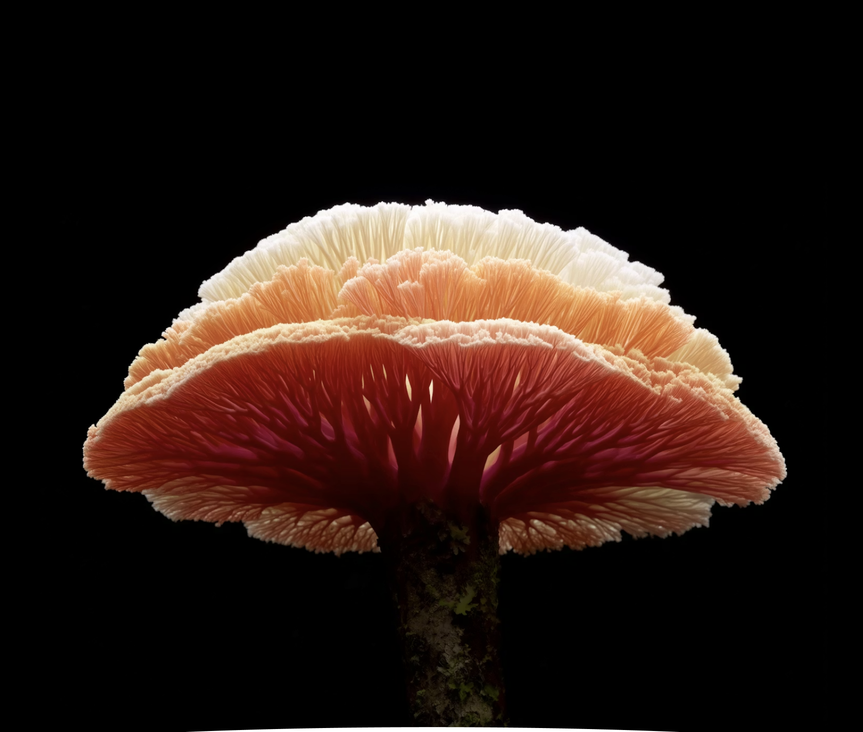
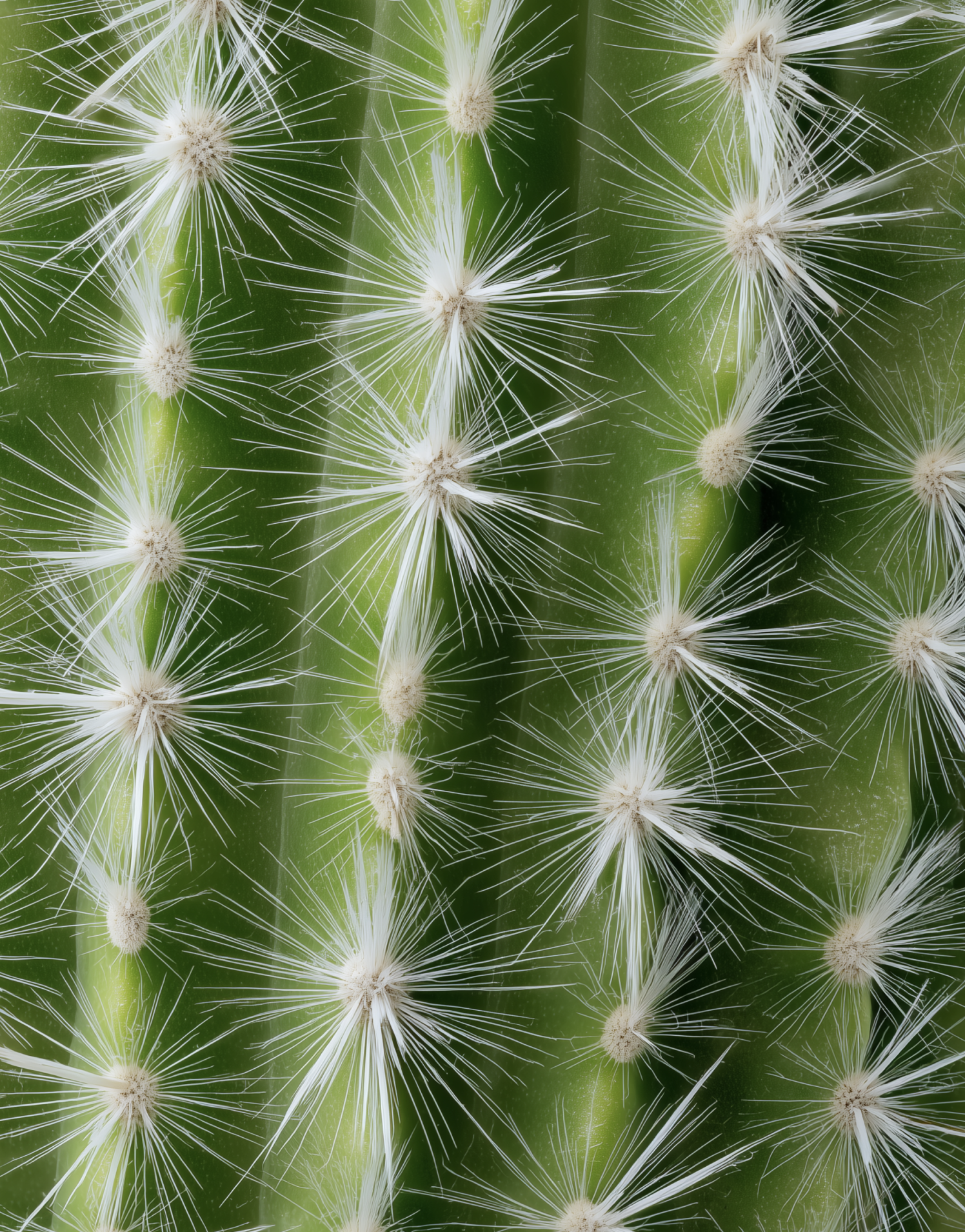
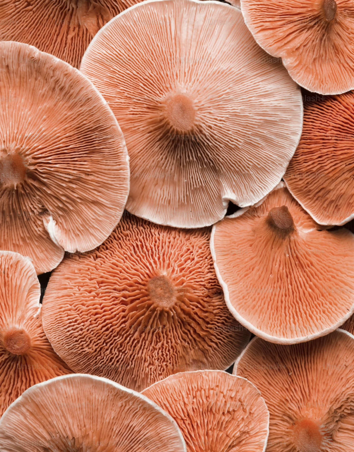
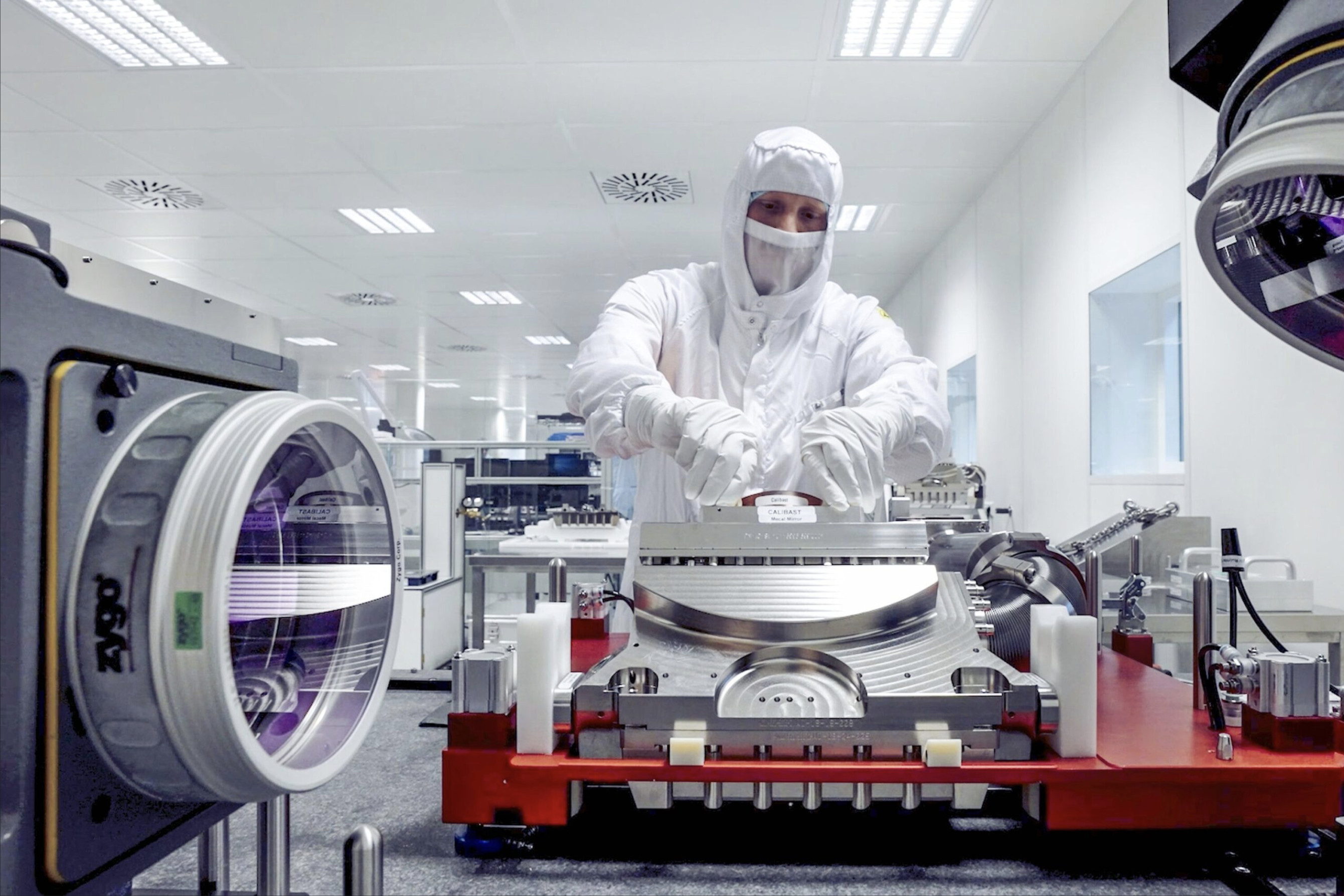
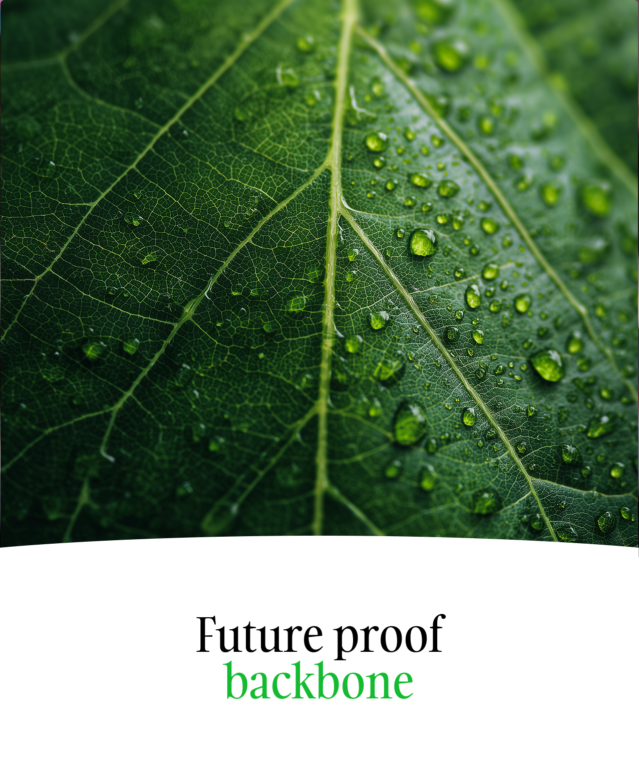
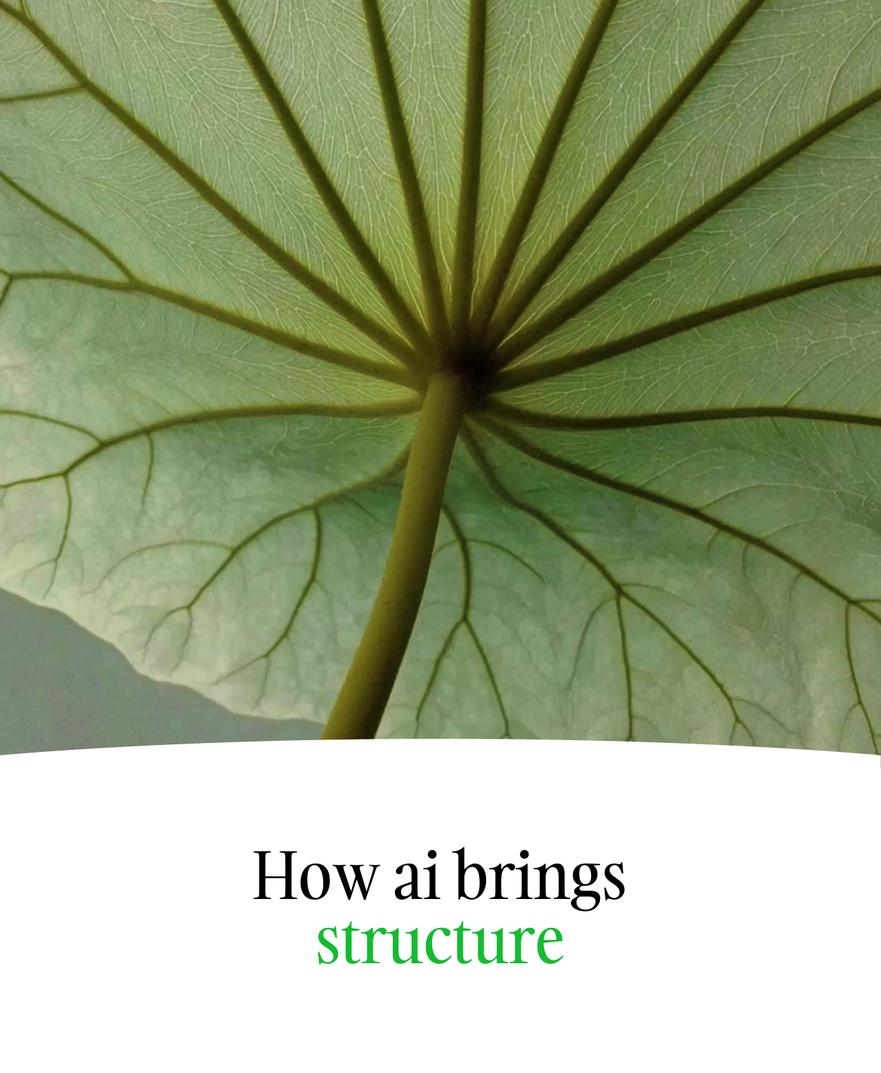
We love images where nature, people, light, and space carry the story, and where complexity is shown through real‑world detail (for example, fractal‑like patterns in leaves, branches, coral, or city structures) instead of digital effects. When technology appears, it should be part of a normal, everyday context—people collaborating around screens, using devices, or moving through spaces—so the focus stays on human ingenuity, not on flashy hardware.


Nature inspired

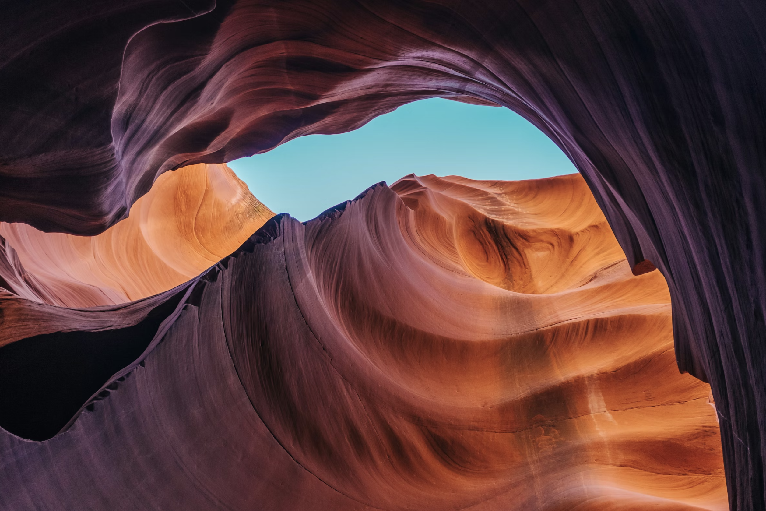
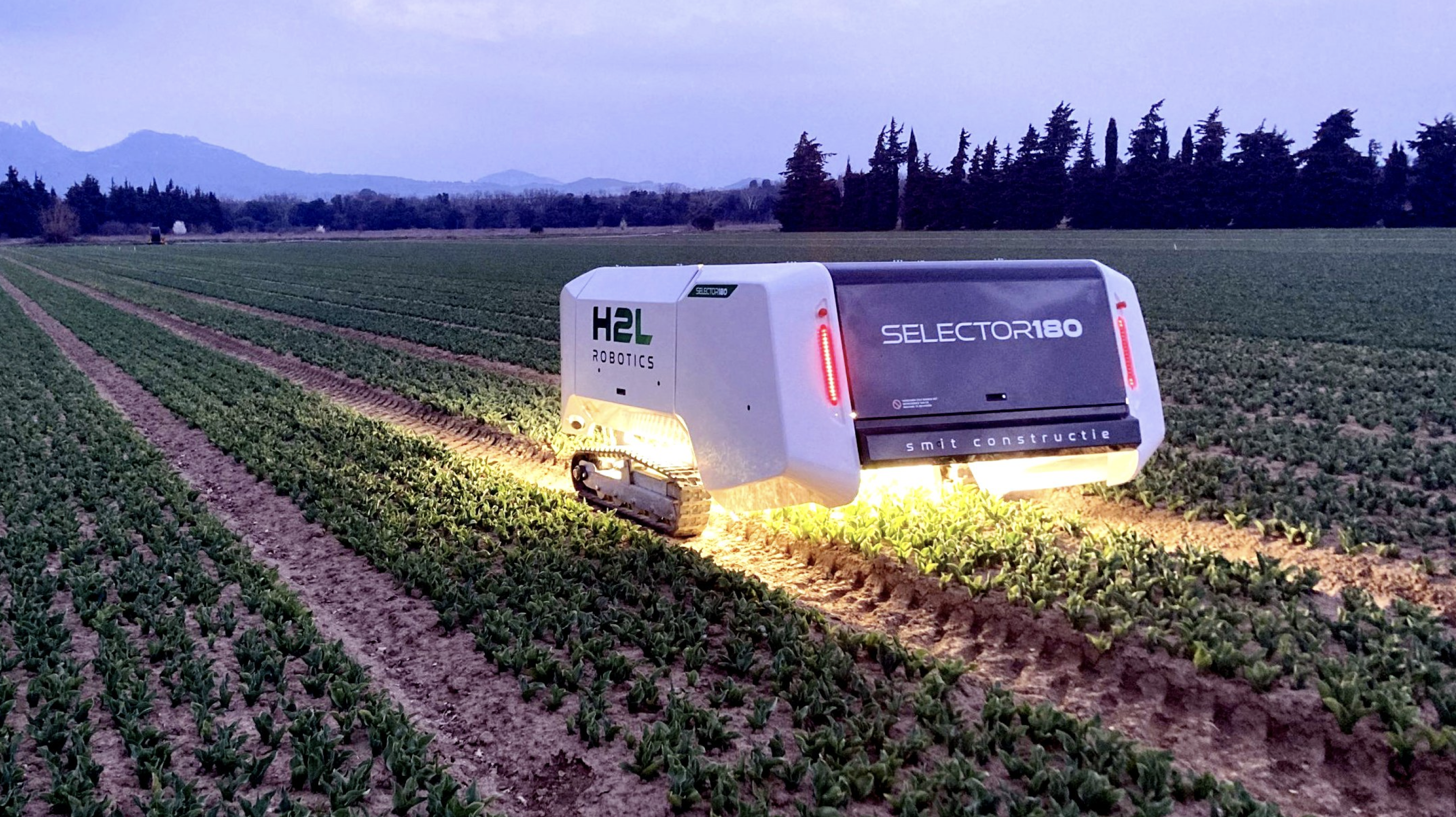
Show the real beauty of nature, from wide, open landscapes that create a sense of space to extreme close‑ups that reveal the “hidden systems” in details. Use nature as a metaphor for complexity, growth, and living intelligence.

People

Show people interacting with one another in authentic ways. The key is emotion: happiness, trust, curiosity, focus—never awkward posing. People should feel like colleagues, partners, and customers, not models dropped into a scene.

Drop Image
Drop Image
Drop Image
Tech

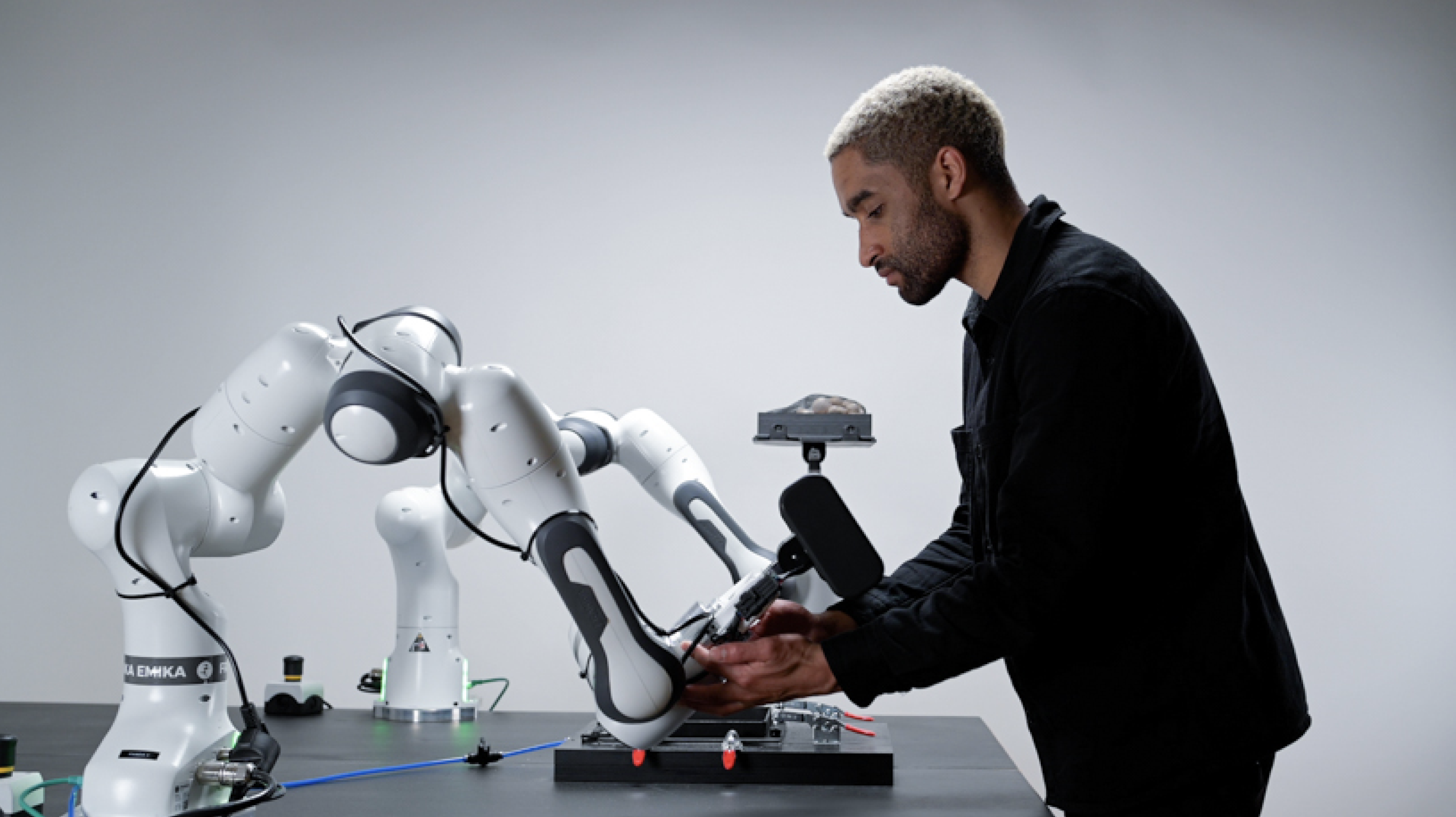
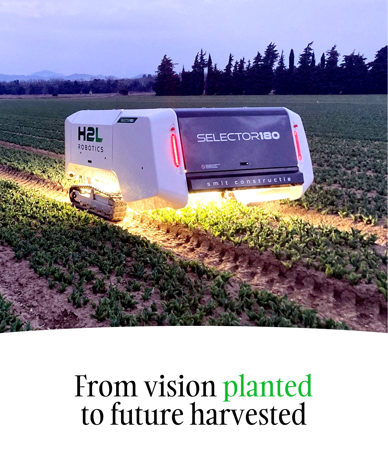
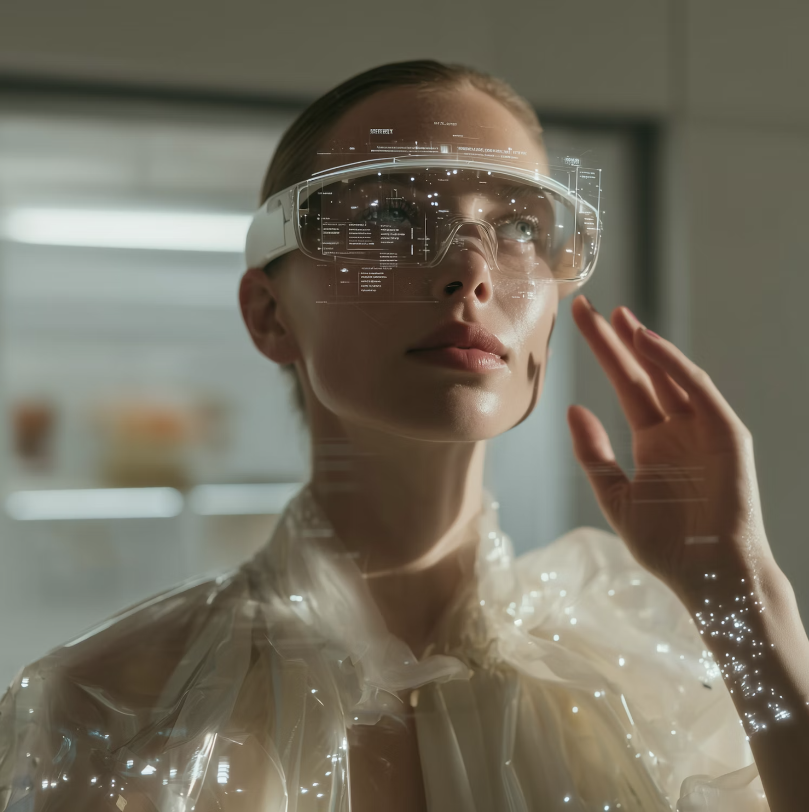
Refrain from overly “fancy” tech shots with glowing elements and sci‑fi interfaces. Show technology being used in normal, real‑world scenarios—on desks, in meeting rooms, in factories or clinics—always in service of people and outcomes, not as the hero by itself.

Horizons

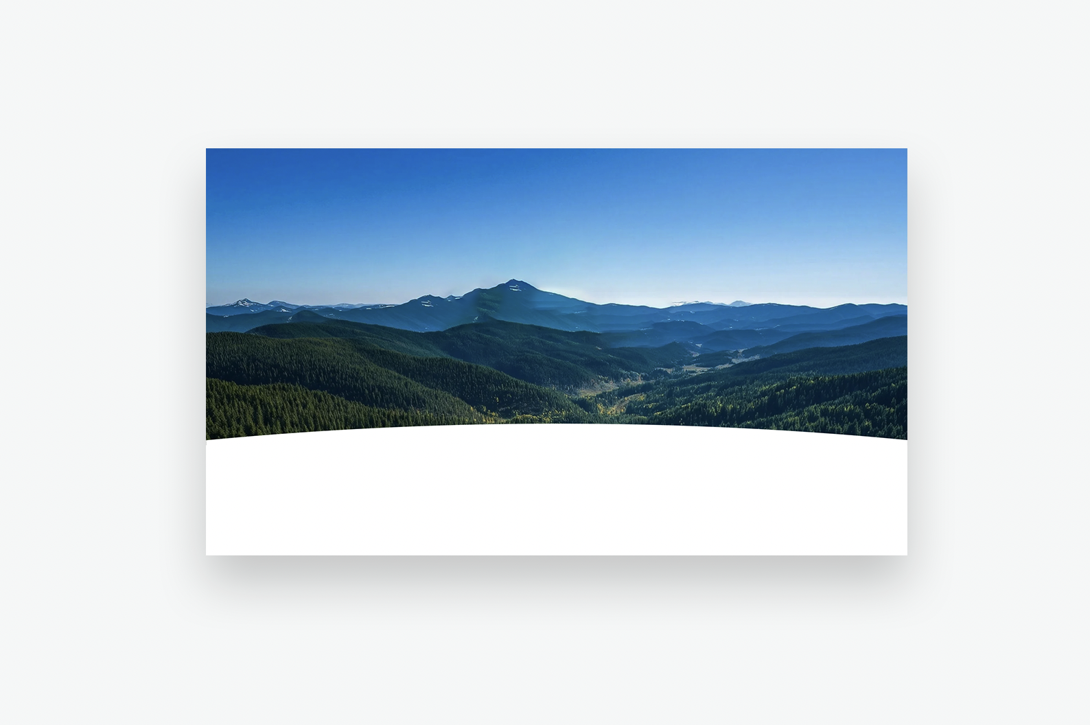
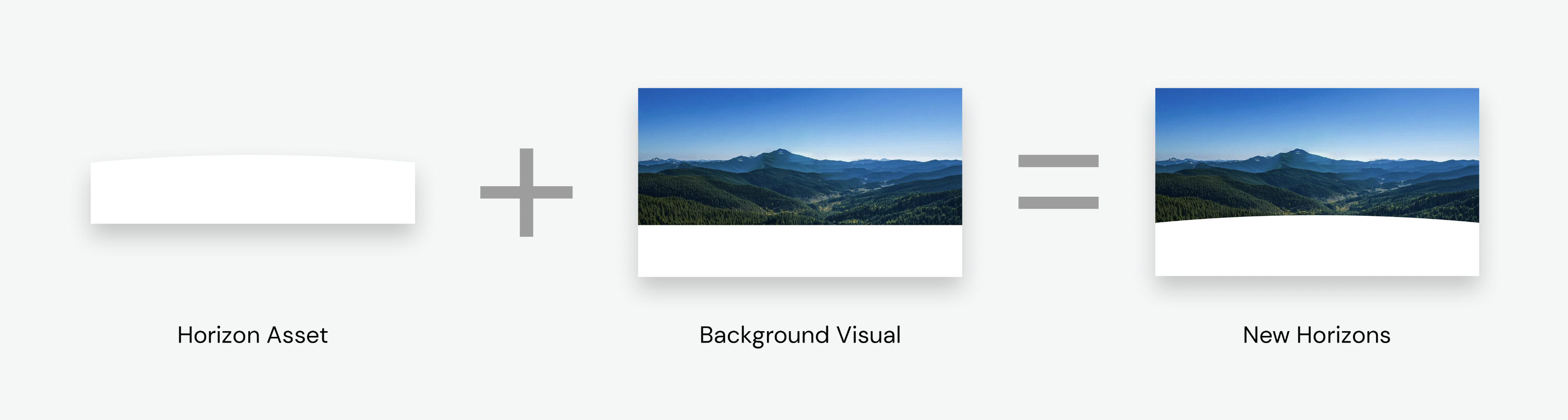
The horizon is a powerful element for Xoriant. It expresses our forward‑thinking nature and our focus on designing for a vision beyond today. Use clear or implied horizons wherever it feels natural—from landscapes where land meets sky to more abstract horizons where a subject meets a calm, even or softly blurred background. Every horizon subtly reinforces New Horizons.

Imagery and text should ALWAYS work together

Every image you choose makes a statement before a single word is read. Used well, imagery amplifies your message — it adds emotion, context, and credibility that copy alone cannot carry. That's why image selection is never an afterthought at Xoriant.

Choose images that extend the idea in your headline, not ones that simply repeat it. If your copy speaks to growth, show a horizon or a detail from nature that suggests expansion. If it's about people, show a genuine moment — not a pose. The image and the words should work together to say something neither could say alone.
When in doubt, ask: does this image add something the text doesn't already say? If not, keep looking.

What we don't want to see

We avoid images that are:

  • Clearly AI‑generated
  • Feel fake
  • Are unnatural: plastic skin, impossible lighting, warped hands, or a “too perfect” synthetic look.


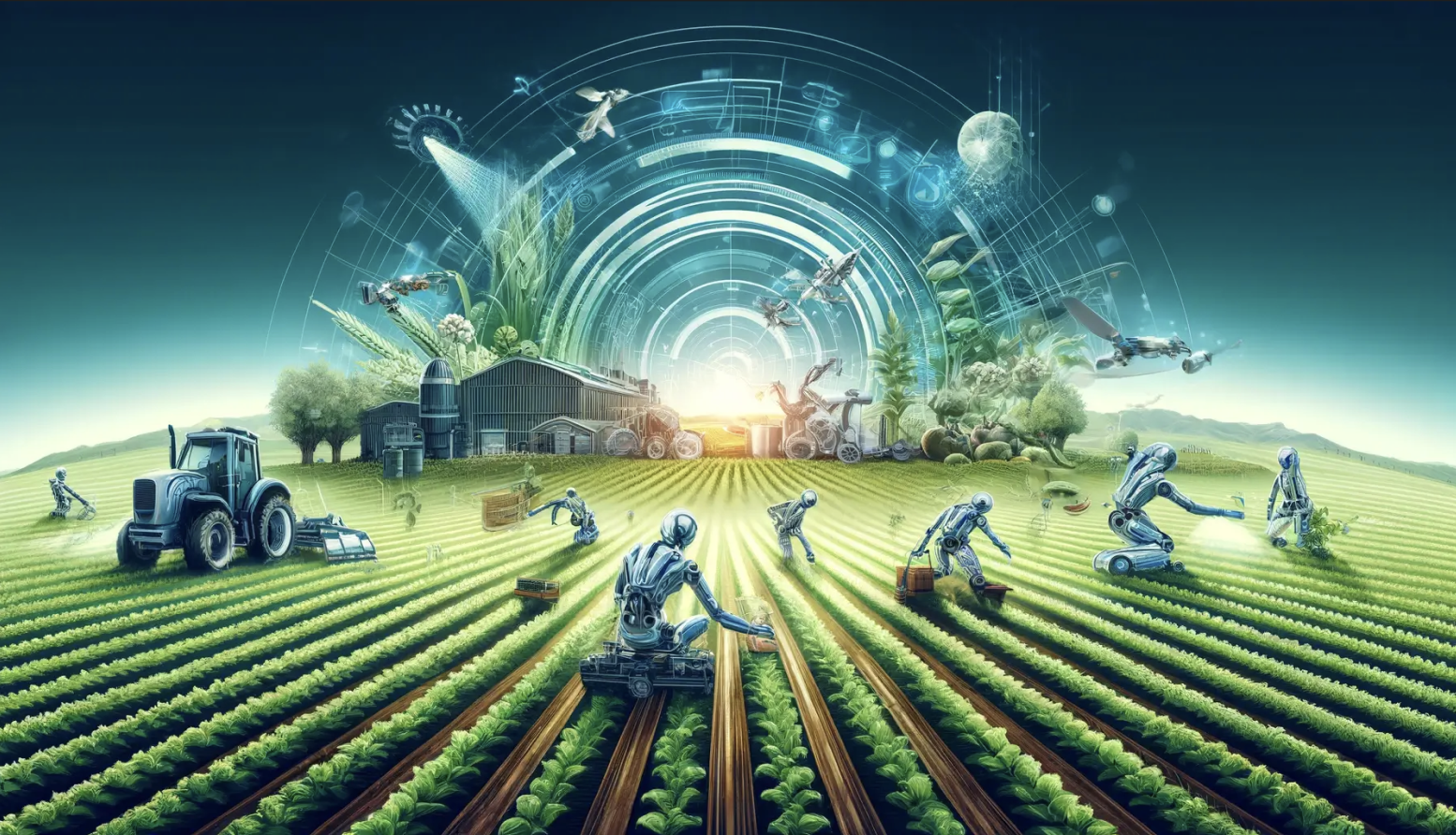
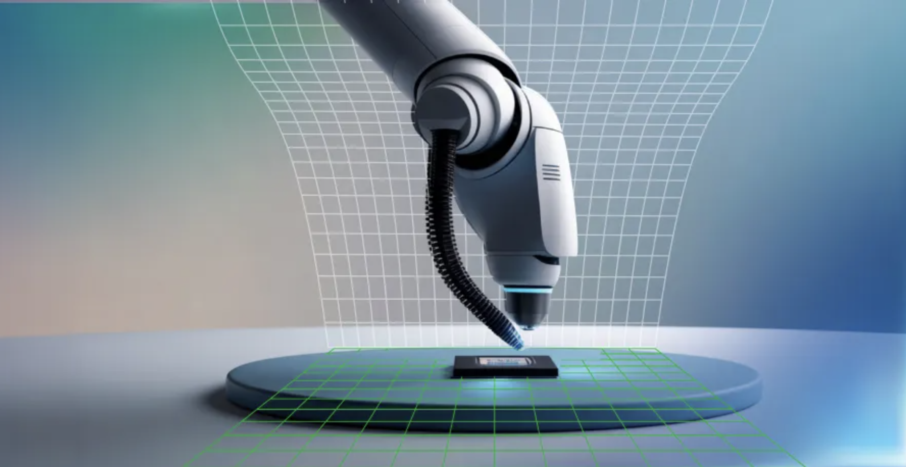
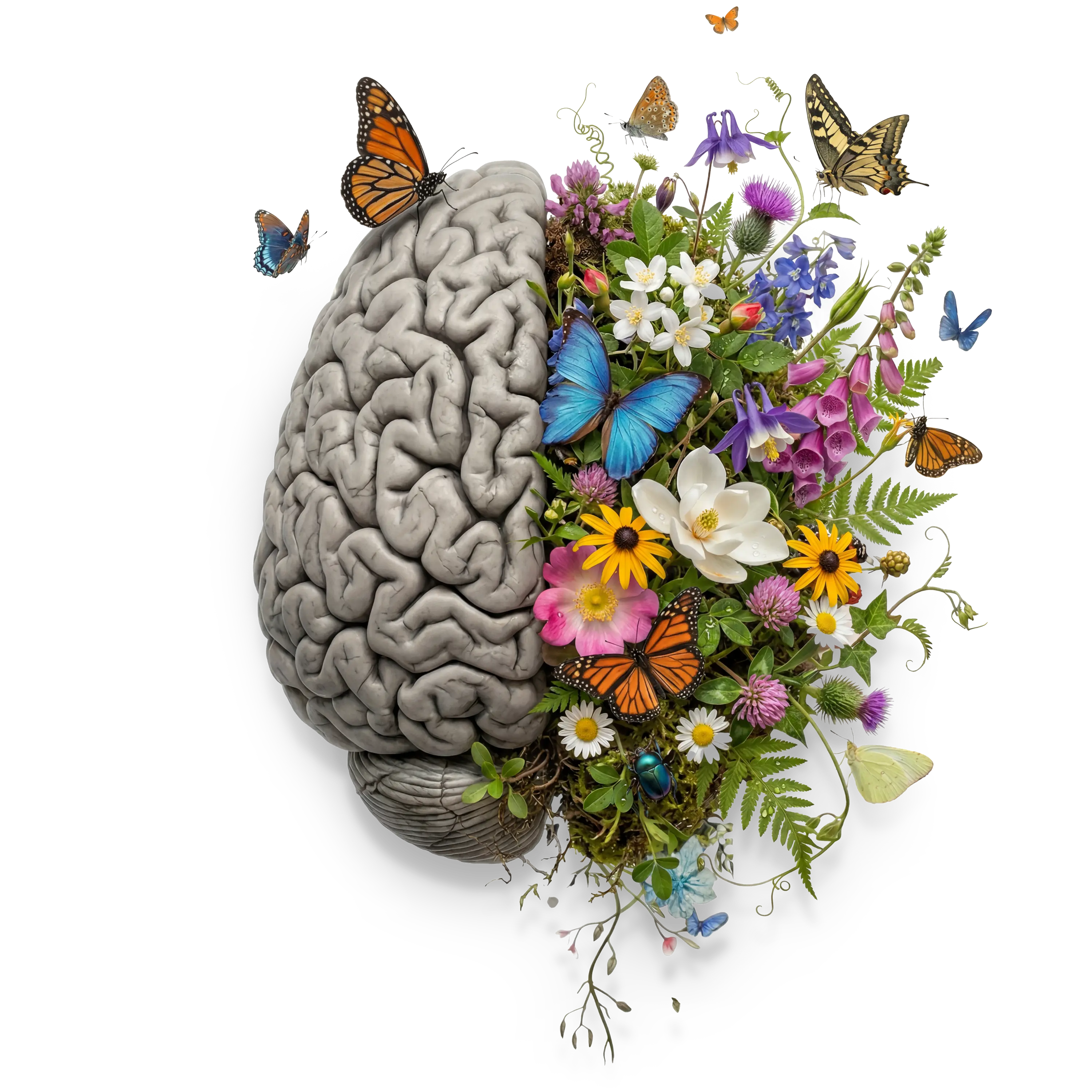
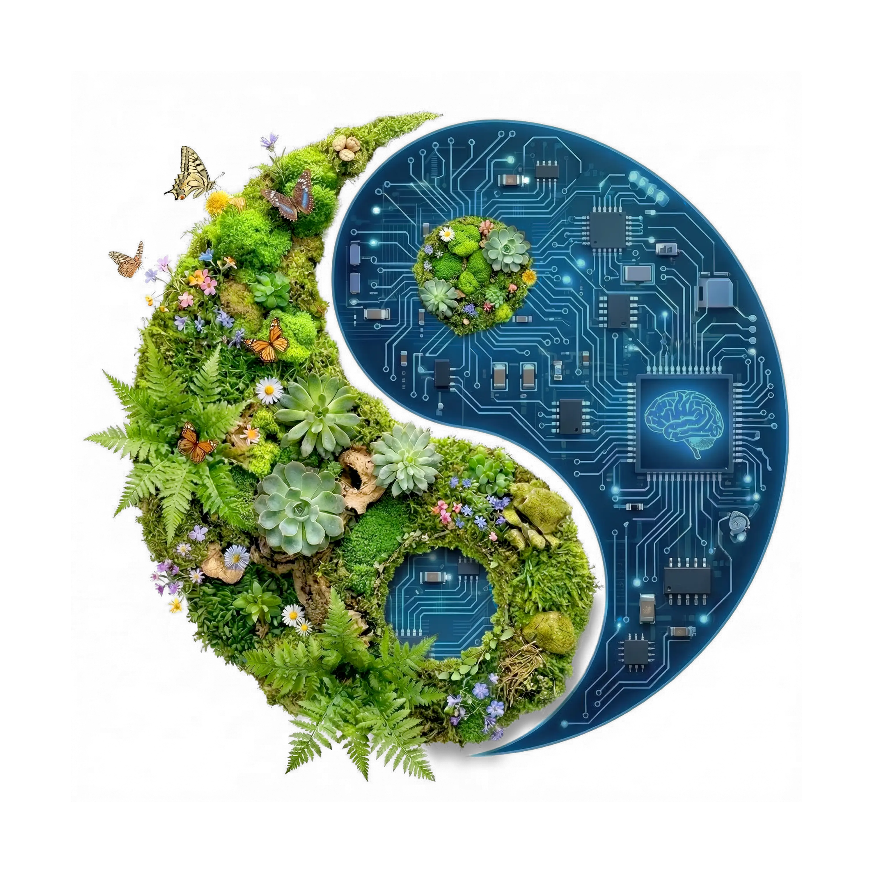
Any image where the main subject is a robot, android face, glowing brain, circuit‑board head, or half‑human/half‑machine portrait is off‑brand.

We also avoid

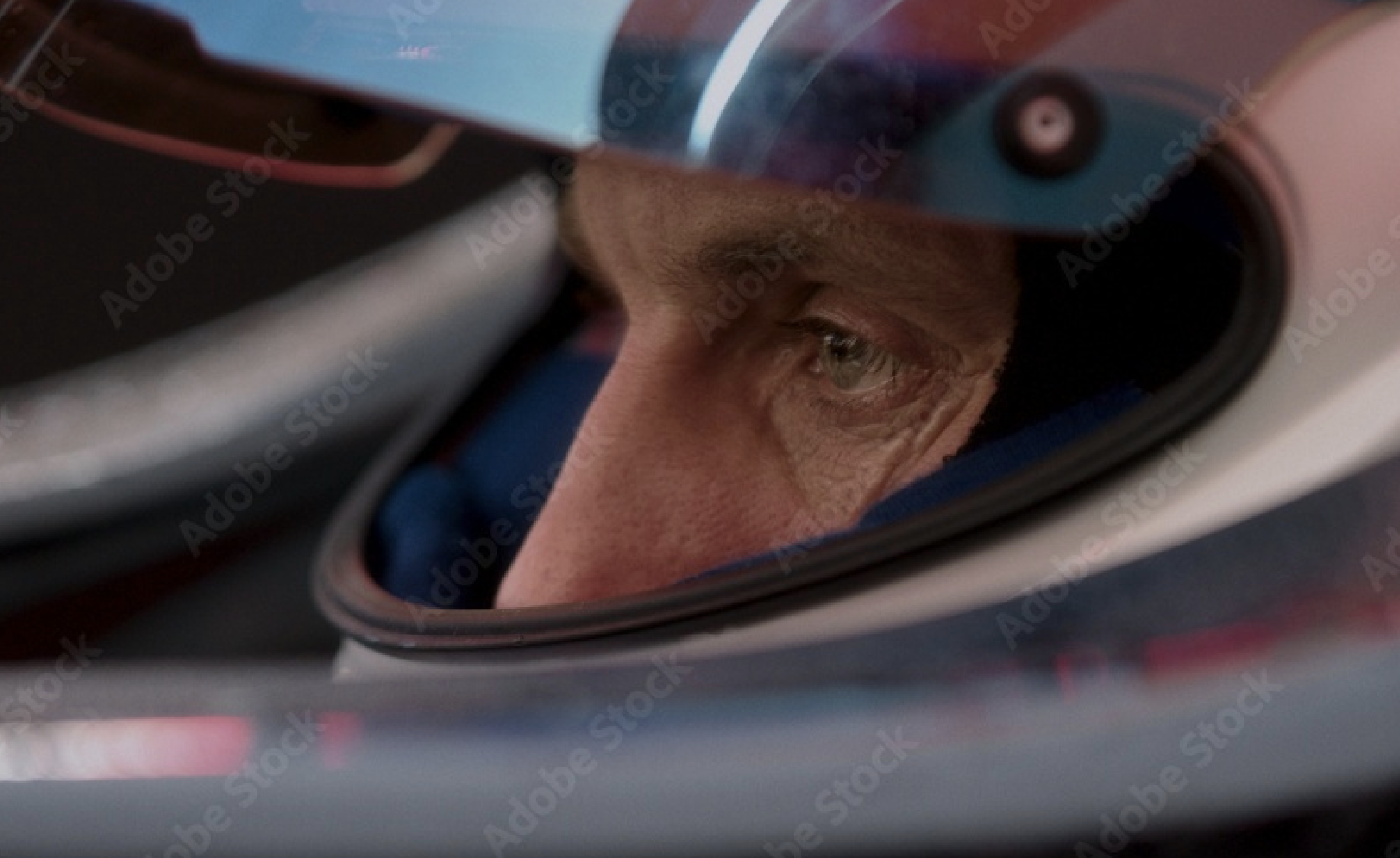
  • heavy, overly dark, hyper‑futuristic tones built on blacks, harsh blues, and neon accents,
  • as well as heavy blue/black gradients with lens flares that scream “generic AI stock image.”
  • Never use “tech” overlays, HUD‑style graphics, or other gimmicky effects—


We are always trying to escape the sea of sameness, not add to it.

Drop Image
Distinctive Brand Assets

Beyond the logo and color palette, Xoriant's visual identity is brought to life through a set of distinctive graphic assets. These elements add depth, energy, and storytelling power to our communications. Use them intentionally and consistently.

The Horizon

The Horizon is Xoriant's signature graphic motif — an abstract visual metaphor for progress, possibility, and the edge of what's next. It gives layouts a sense of scale and direction, reinforcing our positioning as a forward-looking technology partner.

House of Xfactors

The House of Xfactors represents the ecosystem of capabilities that defines Xoriant — a structured, interconnected framework of expertis. Use this asset in thought leadership content, capability overviews, and anywhere we communicate the breadth of what we do.

HI AI

HI AI is Xoriant's expression of human-centered artificial intelligence — the belief that the best technology amplifies human potential. This asset represents our AI proposition and should accompany all AI-related communications, campaigns, and product narratives.